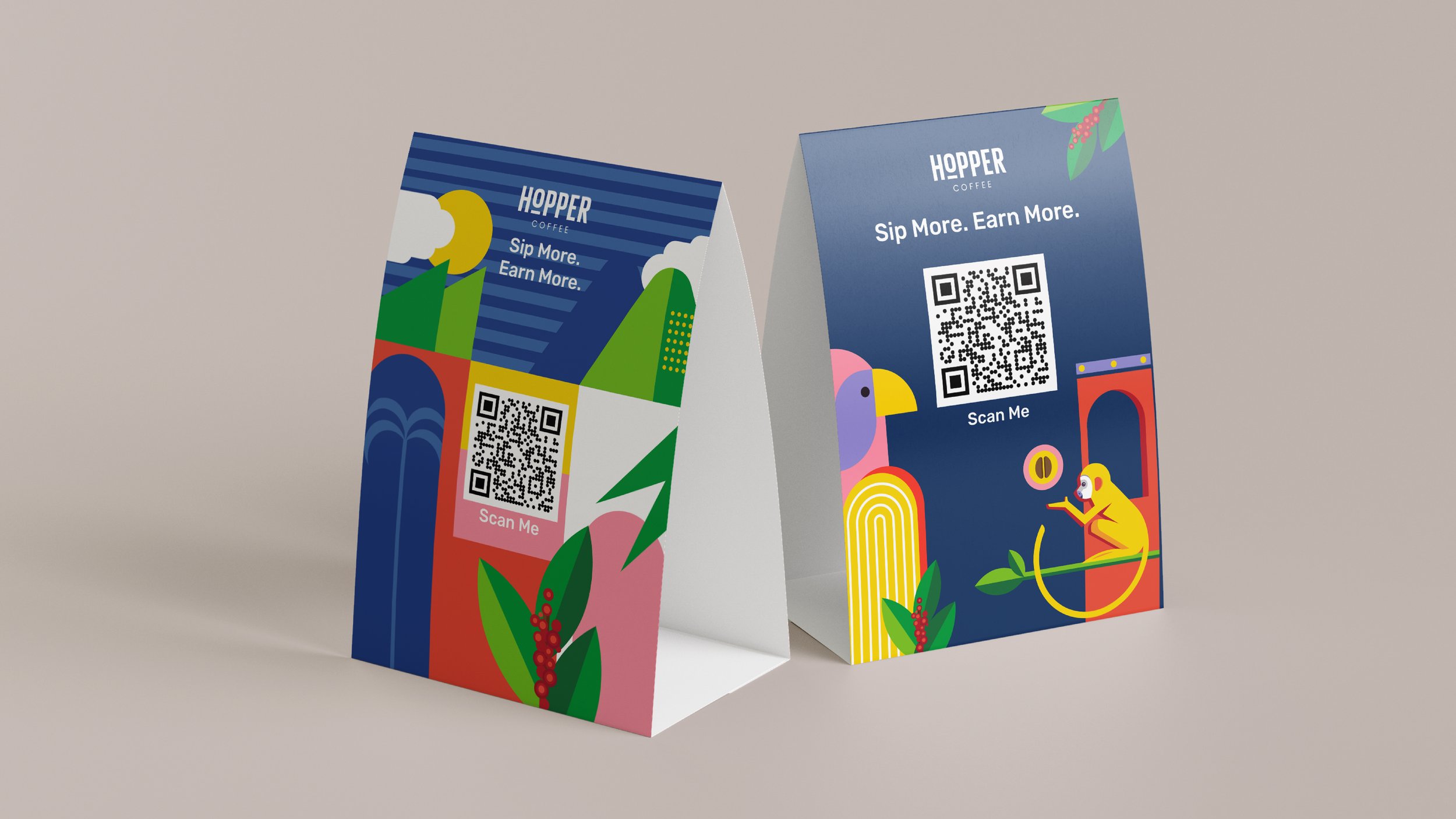
Loyalty Program
Hopper Coffee
Overview: Brewing a digital experience for an independent London based coffee brand
Role: Art Direction, Product Concept, Visual Assets, UI/UX Design
Tools: Figma, Illustrator, Photoshop, Notion
Duration: 2,5 Months

A fresh brew of visual experience.
-
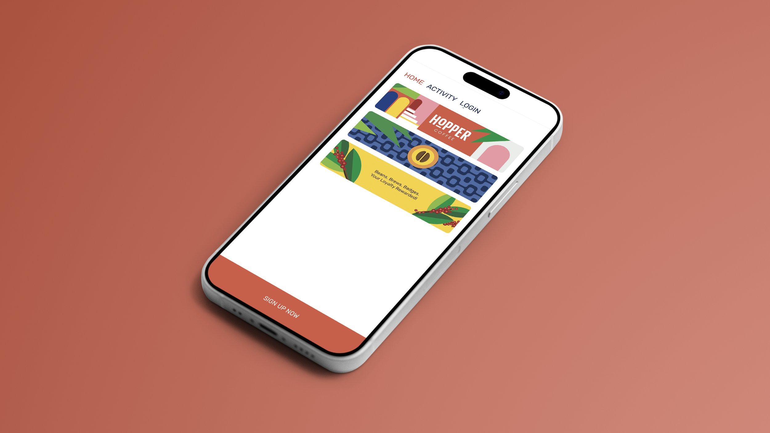
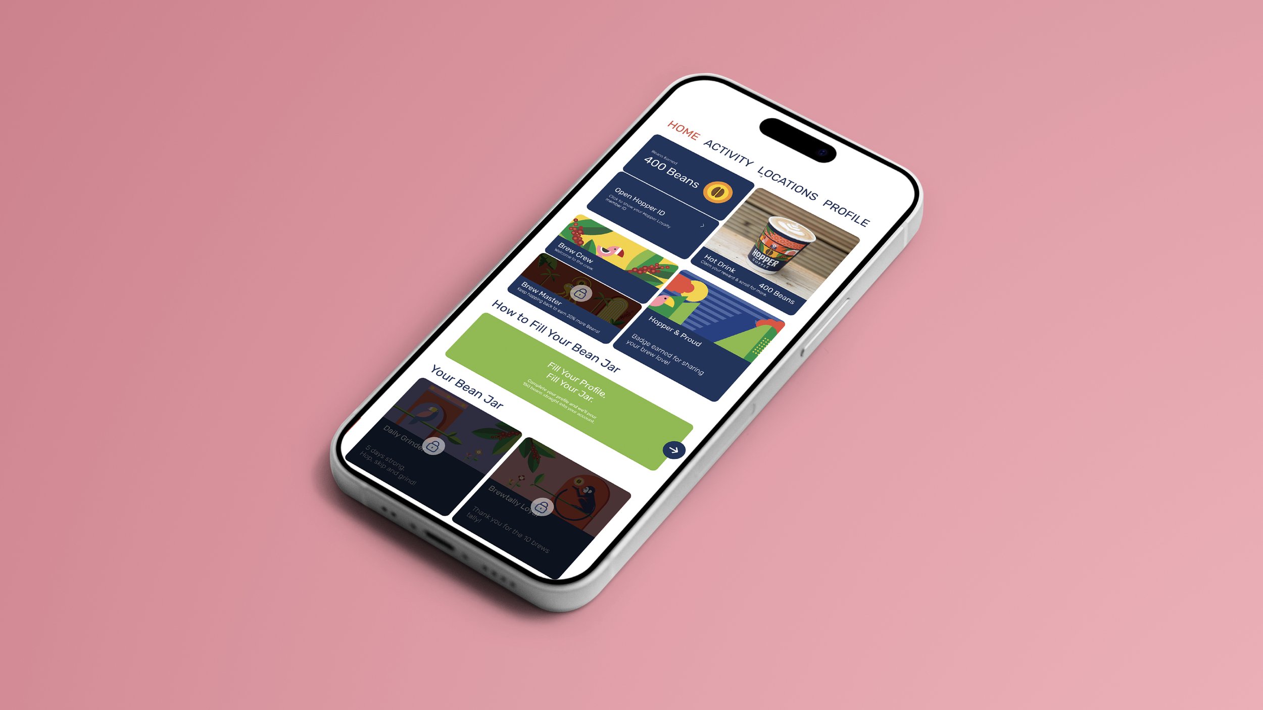
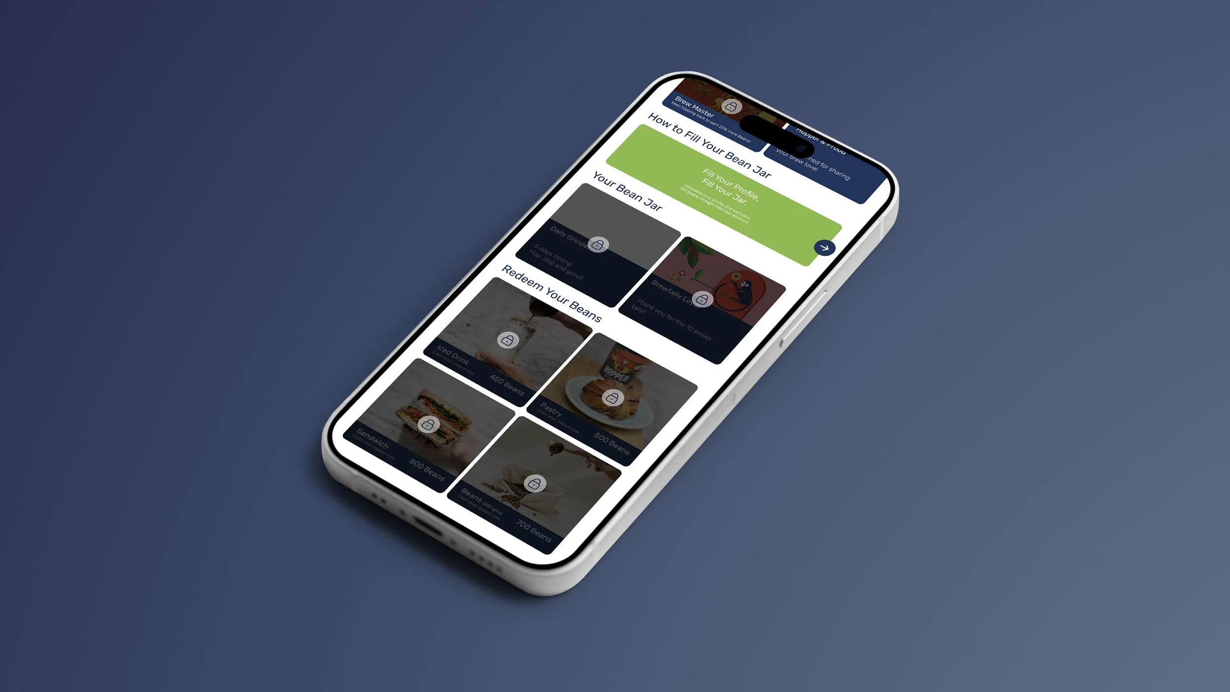
Hopper Coffee needed a loyalty experience that translated the charm of its neighborhood cafés into a digital product. The goal was to maintain the brand’s warm, independent personality while creating a seamless system for rewards, engagement, and customer retention.
-
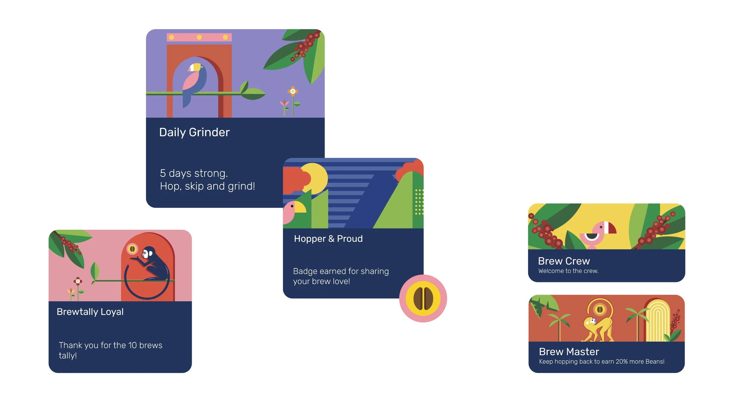
A visual and interaction system was developed that anchors the loyalty program in Hopper’s brand language. This included designing interface elements, iconography, illustrations, and micro-interactions that mirror the café’s cozy atmosphere. The digital experience blends simplicity with craft, ensuring every touchpoint reflects Hopper’s warm, familiar spirit.
-
Visual Identity System: Unified color palette, typography, and iconography tailored for the loyalty platform.
Rewards Interface: Clear, minimal layouts for points, perks, and progress tracking.
User Flows: Streamlined journeys for onboarding, earning, and redeeming rewards.
Illustrative Elements: Custom visuals that reinforce the brand’s handcrafted and local feel.
Digital Touchpoints: Adaptable components designed for website integration and app collaboration.
Local warmth brought into digital experience
〰️
Local warmth brought into digital experience 〰️
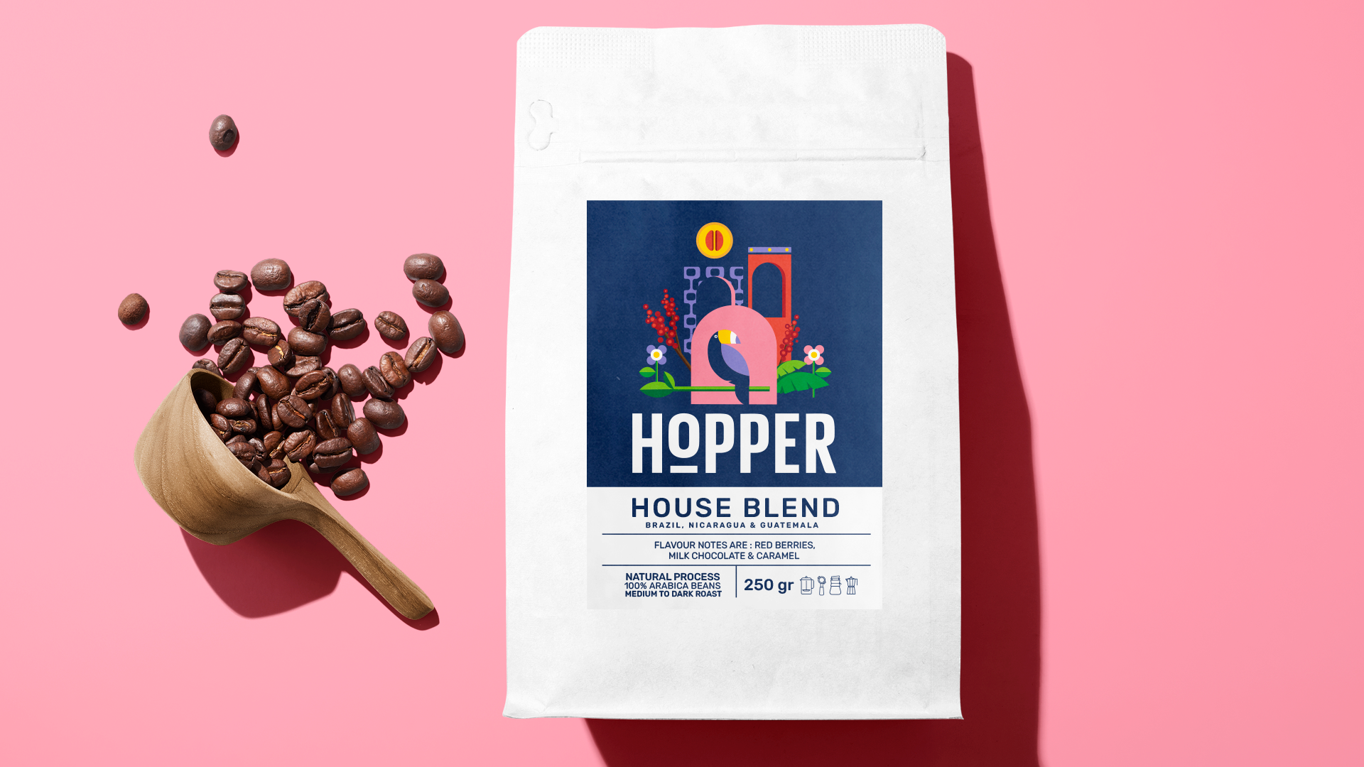
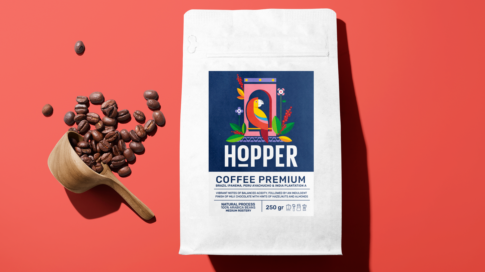
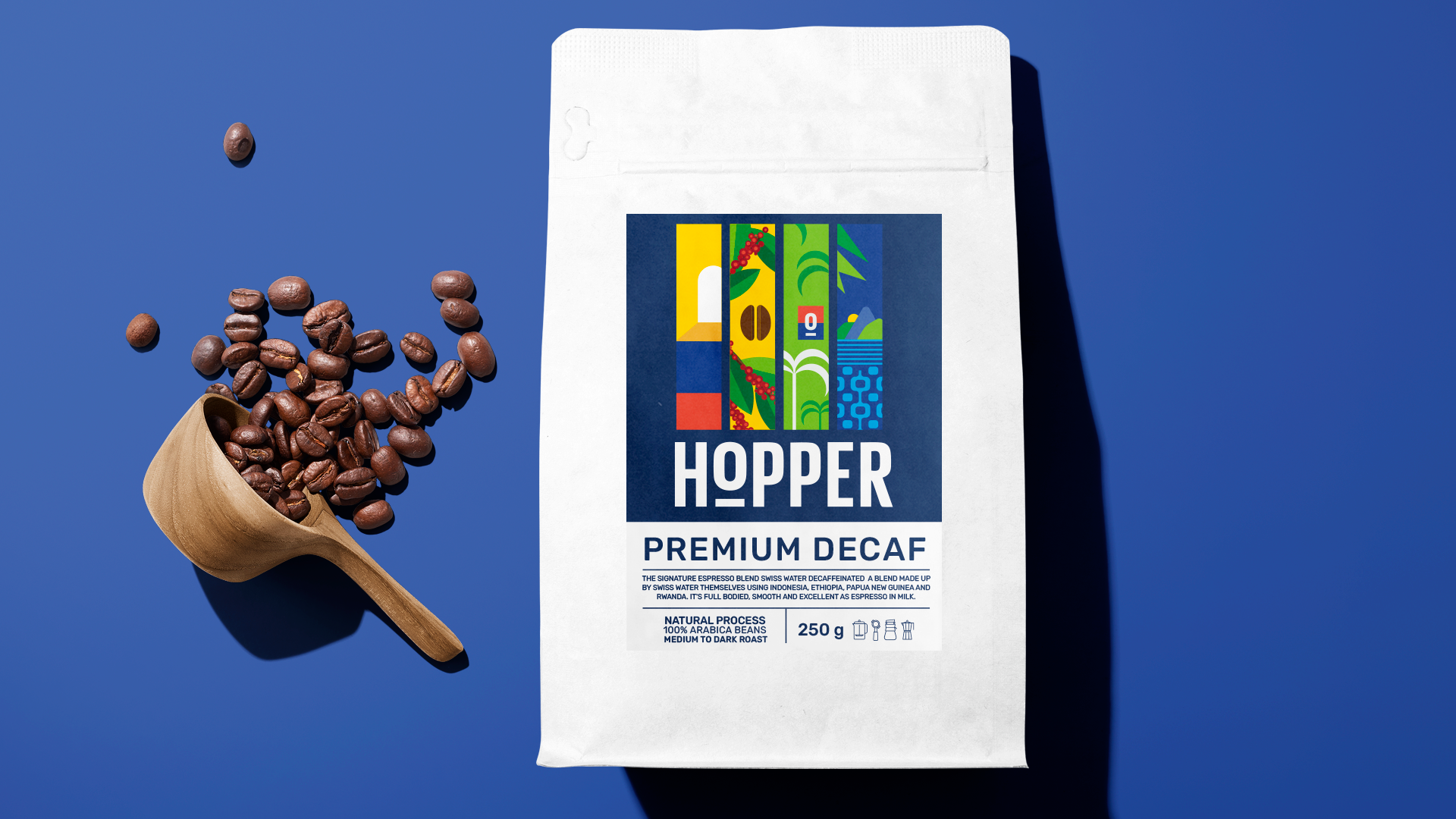
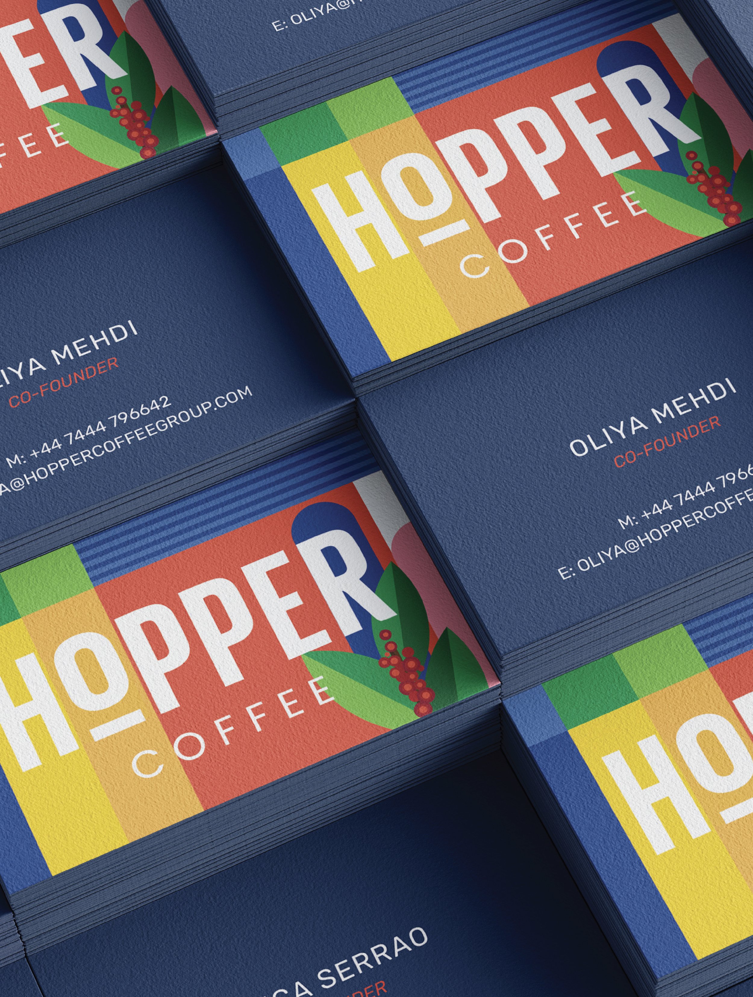
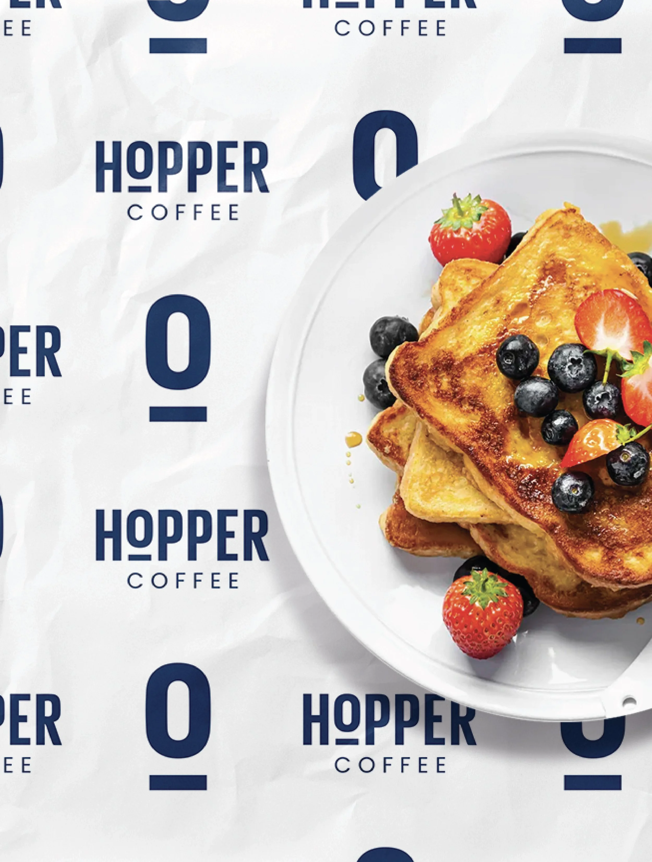
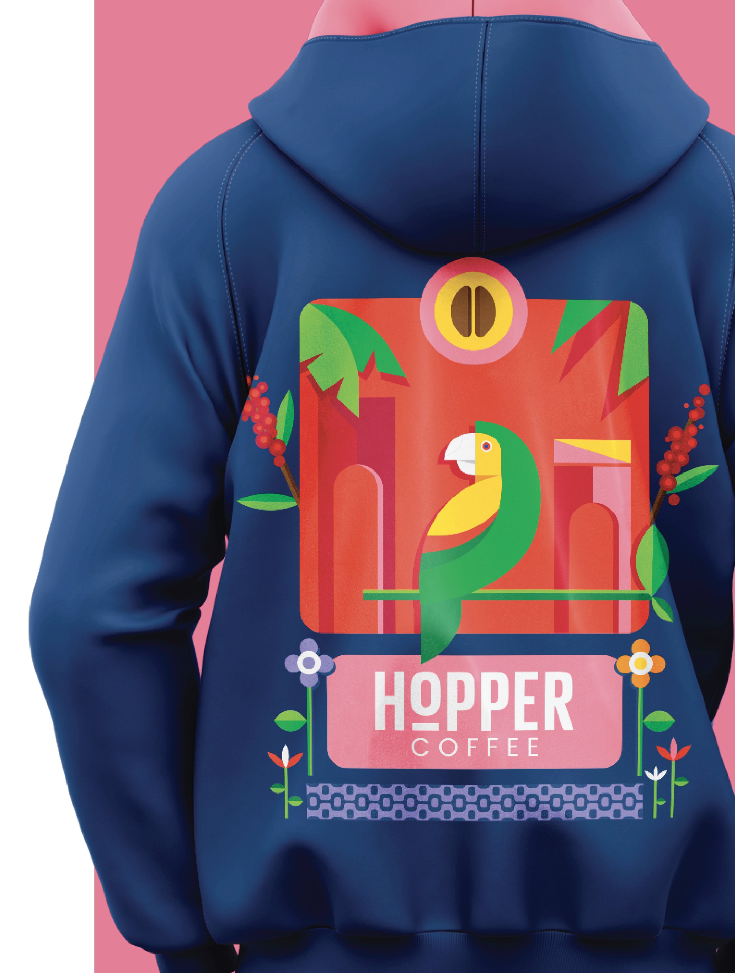
From bean to brand.
Hopper Coffee needed a subtle visual refresh that modernised the overall brand identity while keeping its warmth and familiarity intact. The goal was to update the logo and visual language just enough to feel fresh, without losing the charm that customers recognise and love.
The logo received minimal refinements, updating shapes and typography for a contemporary yet familiar feel. A set of bold, cubism-inspired illustrations was introduced to add an expressive, artistic layer that communicates the brand’s creativity and urban energy. The refreshed system balances warmth with modernity, making the brand instantly recognizable while leaving space to grow.
Takeaways that stuck with me.
-
Learned how to maintain creative consistency across physical and digital touchpoints.
-
Refined my skills in creating user-friendly digital assets that make the brand feel approachable.
-
Improved my ability to align visual and verbal branding.
-
Deepened my strategic thinking for positioning new brands.
-
Sharpened my skill in connecting brand values to visual expression.