Master’s Thesis
Period Saathi
Overview: Designing safe digital spaces for menstrual awareness in India
Role: UX Research, Interaction Design, Product Strategy, Brand Identity, UI Design
Tools: Figma, Photoshop, Illustrator, Miro, Notion
Duration: 4 Months · Grade: 1.3
Saathi means companion
〰️
Saathi means companion 〰️
From problem to prototype.
-
Menstrual health education in India is often shaped by stigma, limited access to reliable information, and the absence of safe, judgment-free spaces to ask questions. User interviews surfaced a sharper problem than stigma alone: people relied on fragmented sources like friends, family, social media, general search, without confidence in what was trustworthy, and there was a real gap between wanting to know something and feeling comfortable enough to ask. The challenge was designing a space that closed that gap: private enough to feel safe, structured enough to give real answers.
-
I built the product around two personas that captured the real spectrum of user need: people actively searching for information, and people with questions they weren't yet comfortable asking directly. That distinction shaped the core information architecture. Rather than a search-and-ask model, I designed for private exploration and low-pressure discovery, letting users browse topics and find answers without having to identify themselves or ask anyone directly.
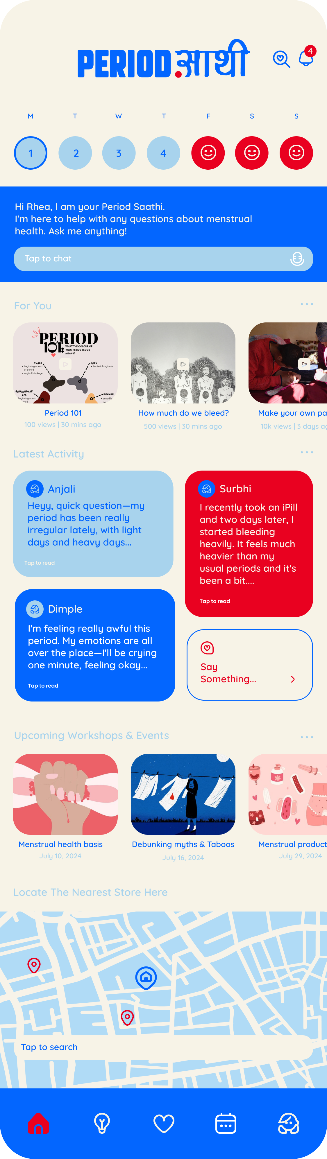
Saathi means companion, and that idea runs through the product. An AI-assisted chat answers questions privately by text or voice, so there's no audience for a question someone feels embarrassed asking. Alongside it sits a community where users choose their own username rather than posting under their real name. That answers the research insight directly: people wanted to know they weren't alone, without having to expose themselves to find out.
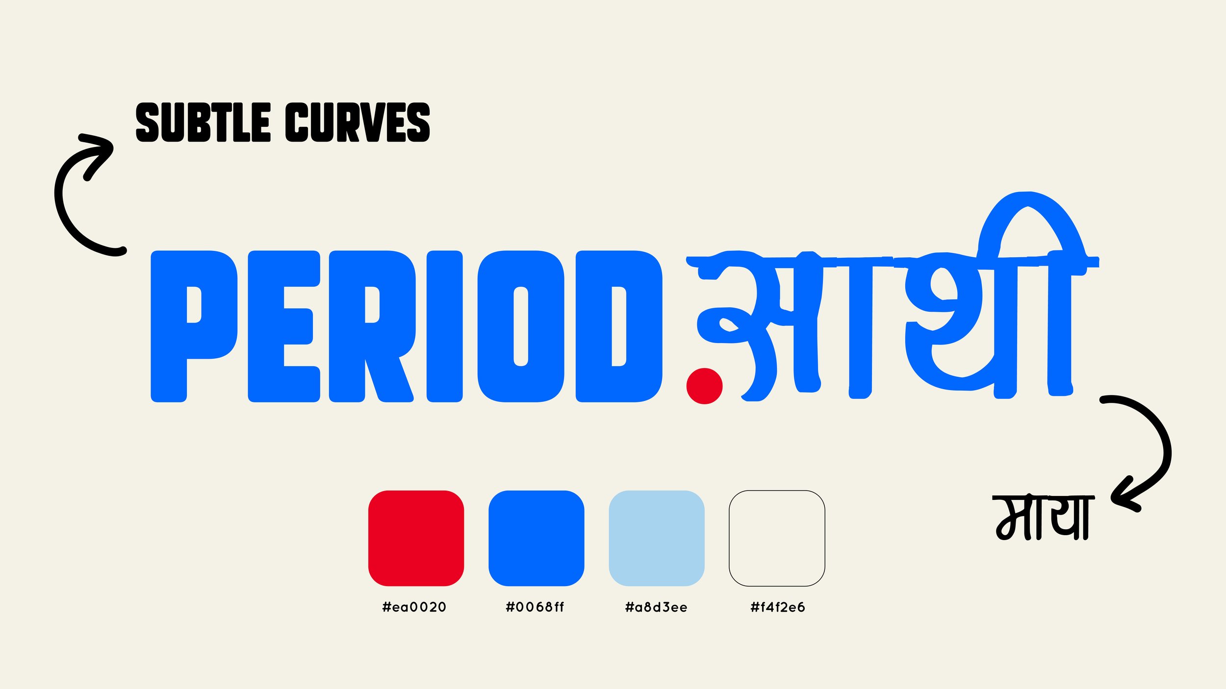
The identity had to make a clinical subject feel approachable. I designed a bilingual logotype pairing Latin and Devanagari with deliberately softened curves, and moved the palette away from the red and pink that dominate this category, leading with blue for its associations with trust and holding red back as an accent.
Usability testing with a trial group showed people understood the platform's purpose, but some content structures asked users to interpret too much before finding what they needed. I simplified the navigation and content hierarchy so key topics were immediately accessible, and rewrote a significant amount of the copy, language that reads as clear from a design perspective can still feel clinical or uncomfortable to someone navigating a sensitive topic.
-
AI-assisted chat guide answering questions privately by text or voice
Community with self-chosen usernames, so users can take part without posting under their real name
Cycle tracking with mood and symptom reflection
Curated education feed with read times and view counts, from cycle basics to myth-busting
Events and workshops listing, plus a map to locate nearby support and products
Persona-driven IA distinguishing active searchers from hesitant askers
Bilingual Latin and Devanagari logotype with softened letterforms, and a blue-led palette moving away from the category default
-
Period Saathi reinforced that reducing friction on a sensitive topic isn't just a navigation problem, it's an emotional one. The most effective changes weren't structural, they were about language and how much exposure a user needed before feeling comfortable finding an answer. It's the project that most shaped how I think about designing for ambiguity: when the real user need isn't clearly stated upfront, research has to work harder to surface it.
Where support feels familiar
〰️
Where learning feels gentle
〰️
Where culture meets comfort
〰️
Designed for her peace of mind
〰️
Where support feels familiar 〰️ Where learning feels gentle 〰️ Where culture meets comfort 〰️ Designed for her peace of mind 〰️