Woven
Overview: Designing the sole online storefront for an online-only laundry detergent brand
Role: UX Research, Information Architecture, Wireframing, UI Design, Iconography, Design Systems
Tools: Figma, Miro
Status: In development with the client's engineering team
Launching soon
〰️
Launching soon 〰️

Your online laundry solution.
-
Woven is an online-only laundry detergent brand, its website isn't a marketing site sitting alongside a shop, it is the shop. With multiple product variants, use cases, and technical information to communicate, the risk was building a browsing experience that felt like a technical e-commerce catalogue rather than a warm, approachable consumer brand. The challenge was making product discovery feel simple and confident, without stripping out the information customers needed to choose the right product.
-
I designed Woven's e-commerce experience end-to-end, user flows, information architecture, wireframes, and a UI component library, working through to build with the client's development team.
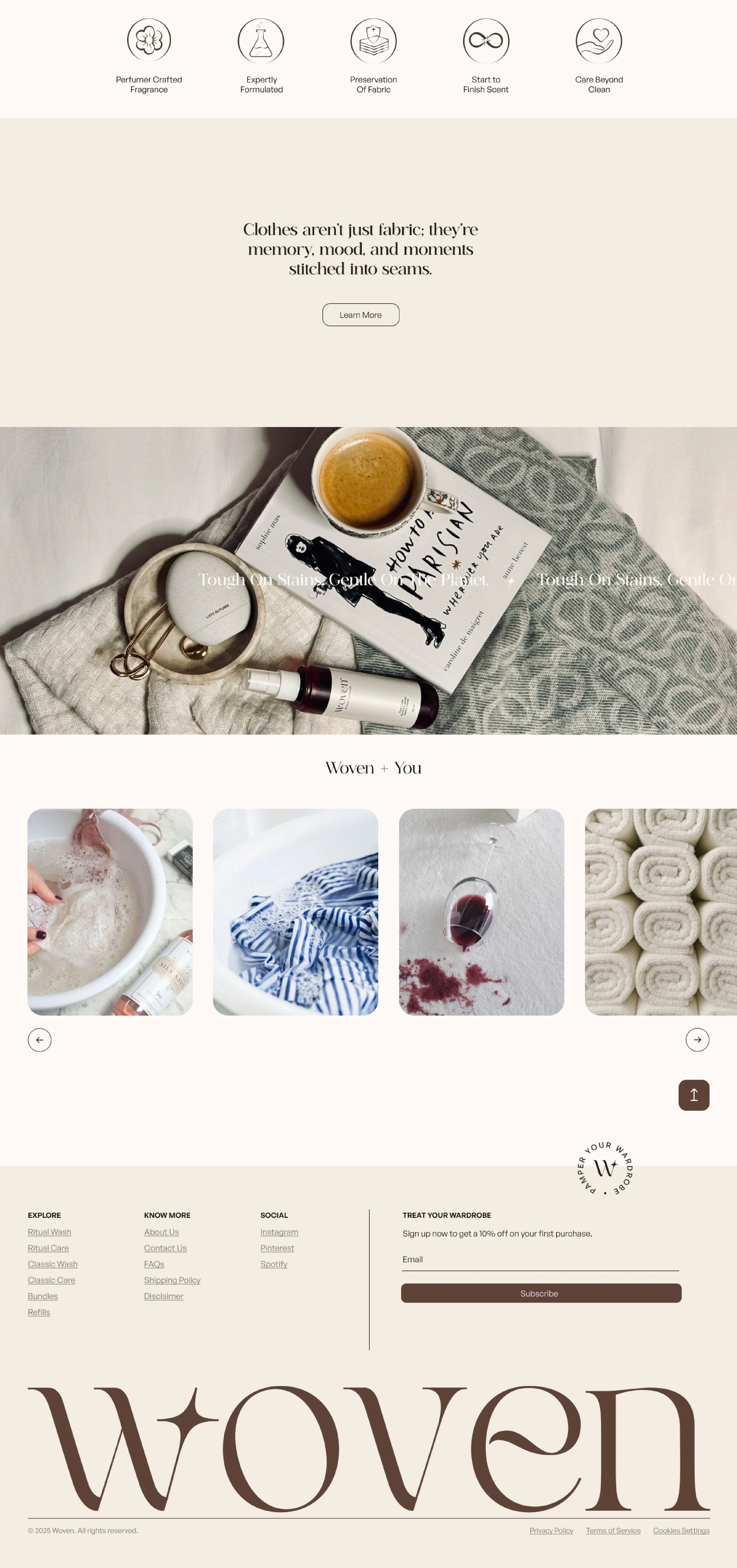
I structured the range into three product categories: Wash, Care, and Refresh. Keeping the top level to three made browsing simple and stopped the site feeling like a technical catalogue. On top of that I layered use-case entry points through a "Woven + You" section, giving customers who think in terms of their own situation a way in, alongside practical tips on using the products.
User interviews reinforced this direction. Customers weren't especially interested in the technical differences between formulas, they wanted practical answers: is this right for my clothes, how much do I need, will it actually work? That shifted the UI toward leading with clear benefits and usage information rather than feature lists or brand copy.
Usability testing surfaced a second insight: people were scanning product pages, not reading them. I simplified content-heavy sections, strengthened visual hierarchy, and pulled benefit and usage information to the top of the page so it could be absorbed at a glance.
-
Three-category product structure (Wash, Care, Refresh) with use-case entry points layered on top, keeping discovery simple across multiple product variants
Custom set of 15+ brand icons designed to extend the visual system across the site
Benefit-first product pages, restructured after usability testing showed users scan rather than read
Reusable UI component library, built to scale as the product range grows
Visual system designed for a single-channel consumer brand, no physical shelf or salesperson to lean on
-
Woven's website is currently in development, ahead of launch as the brand's sole sales channel. Designing for a brand where the website is the business sharpened how I think about discovery: every category, filter, and line of copy has to earn its place. The clearest lesson was that customers don't browse products, they scan for reassurance. Design's job is to make that reassurance findable in seconds, not paragraphs.